OMOTESANDO HILLS
The appearance of the pavilion is sublimated into the design of the digital flagship.
OVERVIEW
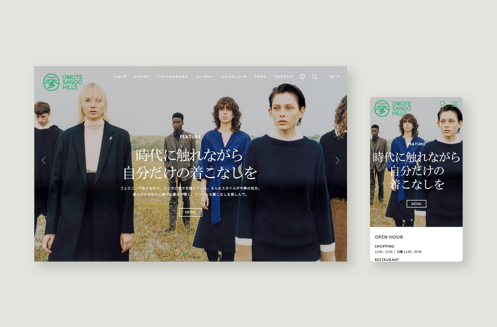
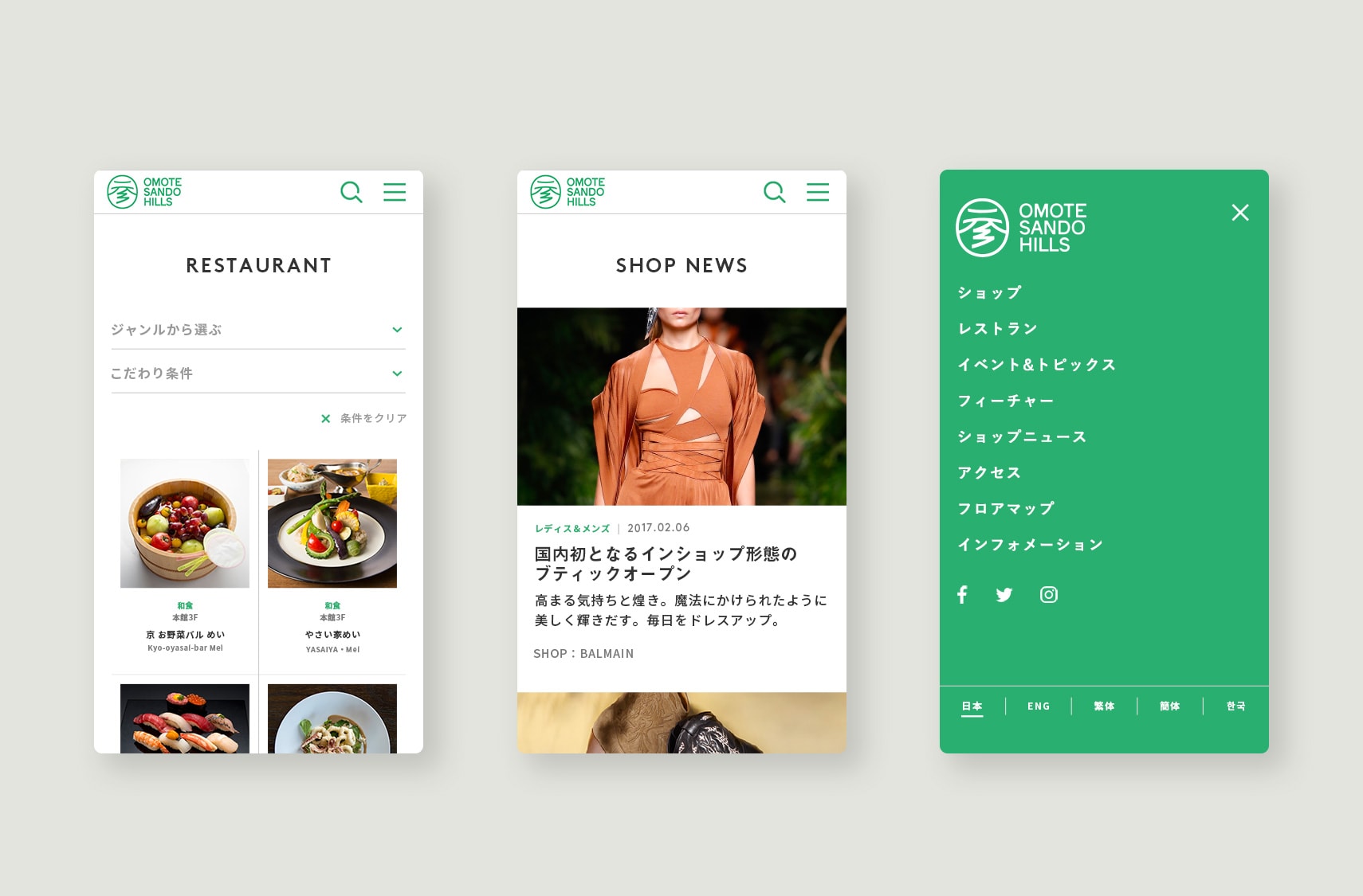
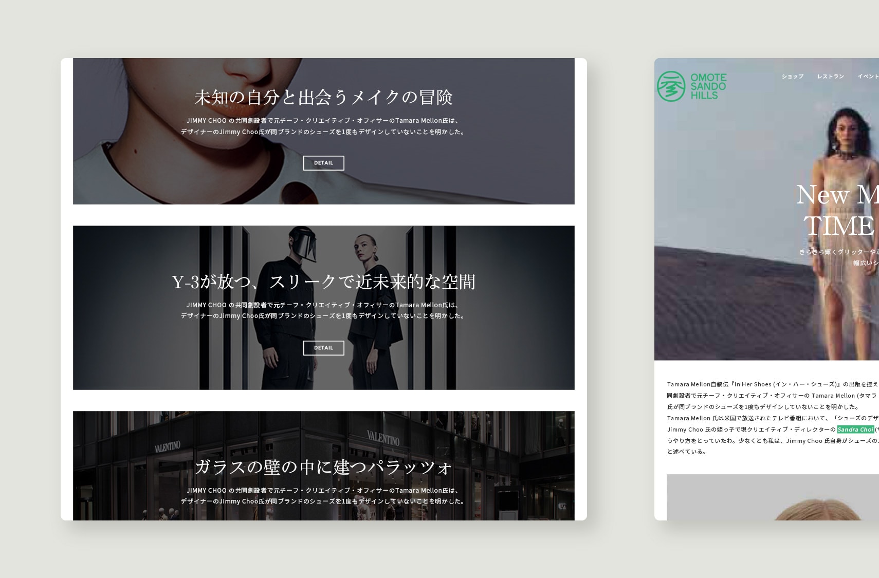
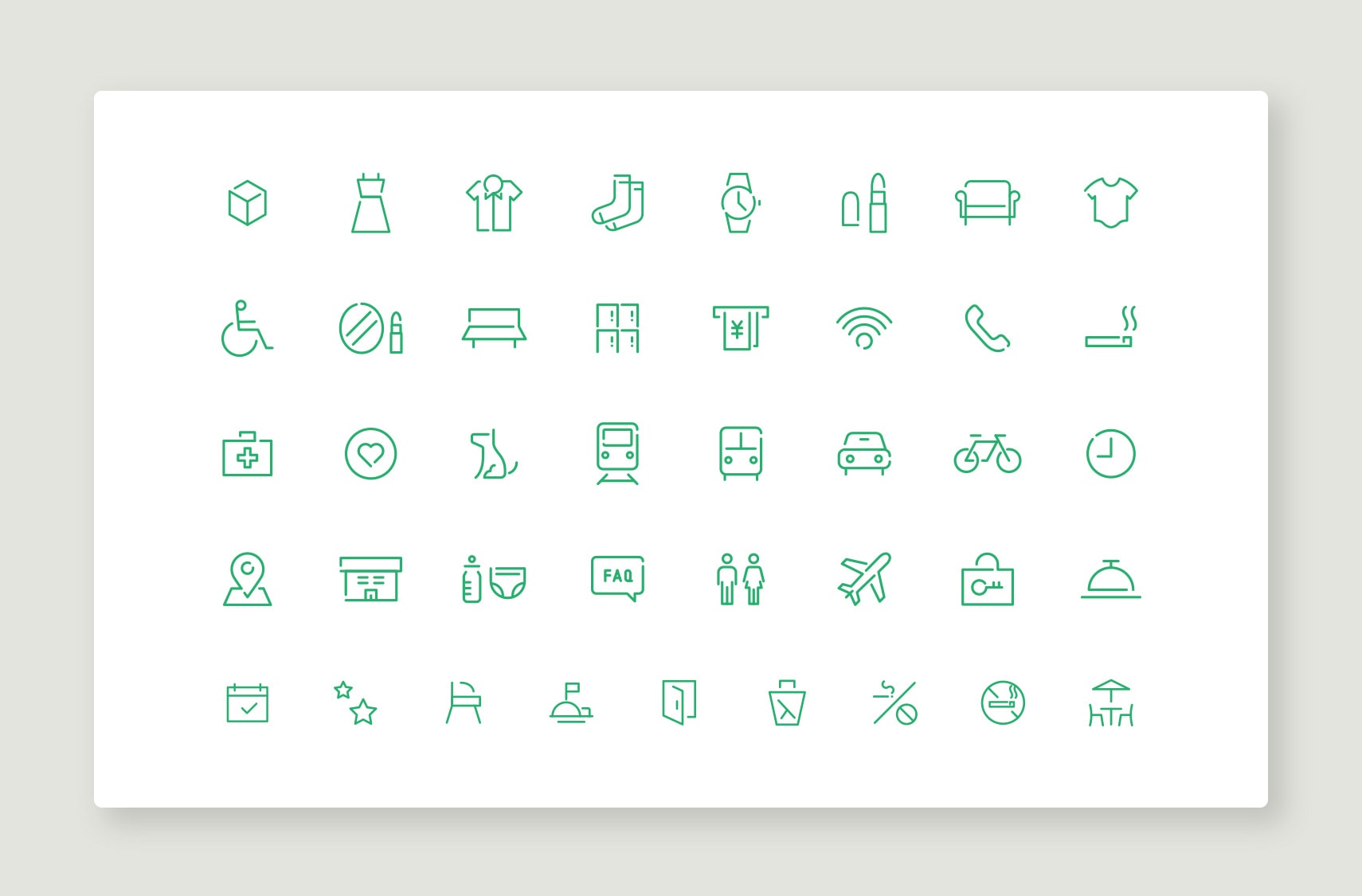
Omotesando Hills is a landmark symbolic of Omotesando. We were in charge of art direction, UI&UX design and construction, and content direction for the website renewal for the 10th anniversary of its opening. The Japanese typography highlights the dignity and diversity of the pavilion, which encompasses everything from high-end brands to trendy sweets stores. The green brand color was inspired by the zelkova tree, and the single-stroke icon was designed to resemble a straight stretch of Omotesando Avenue.
TEAM
- CREATIVE DIRECTOR :KAIE MURAKAMI
- ART DIRECTOR :OSAMU JIMBA
- DESIGNER :OSAMU JIMBA
- PLANNING :RINA KYORAKU
- PRODUCER :TAKAMICHI MASUNAGA