OMOTESANDO HILLS
From museum to digital flagship
OVERVIEW
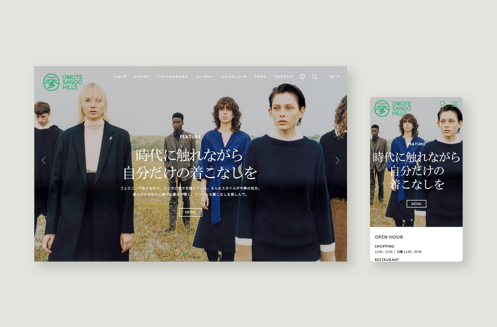
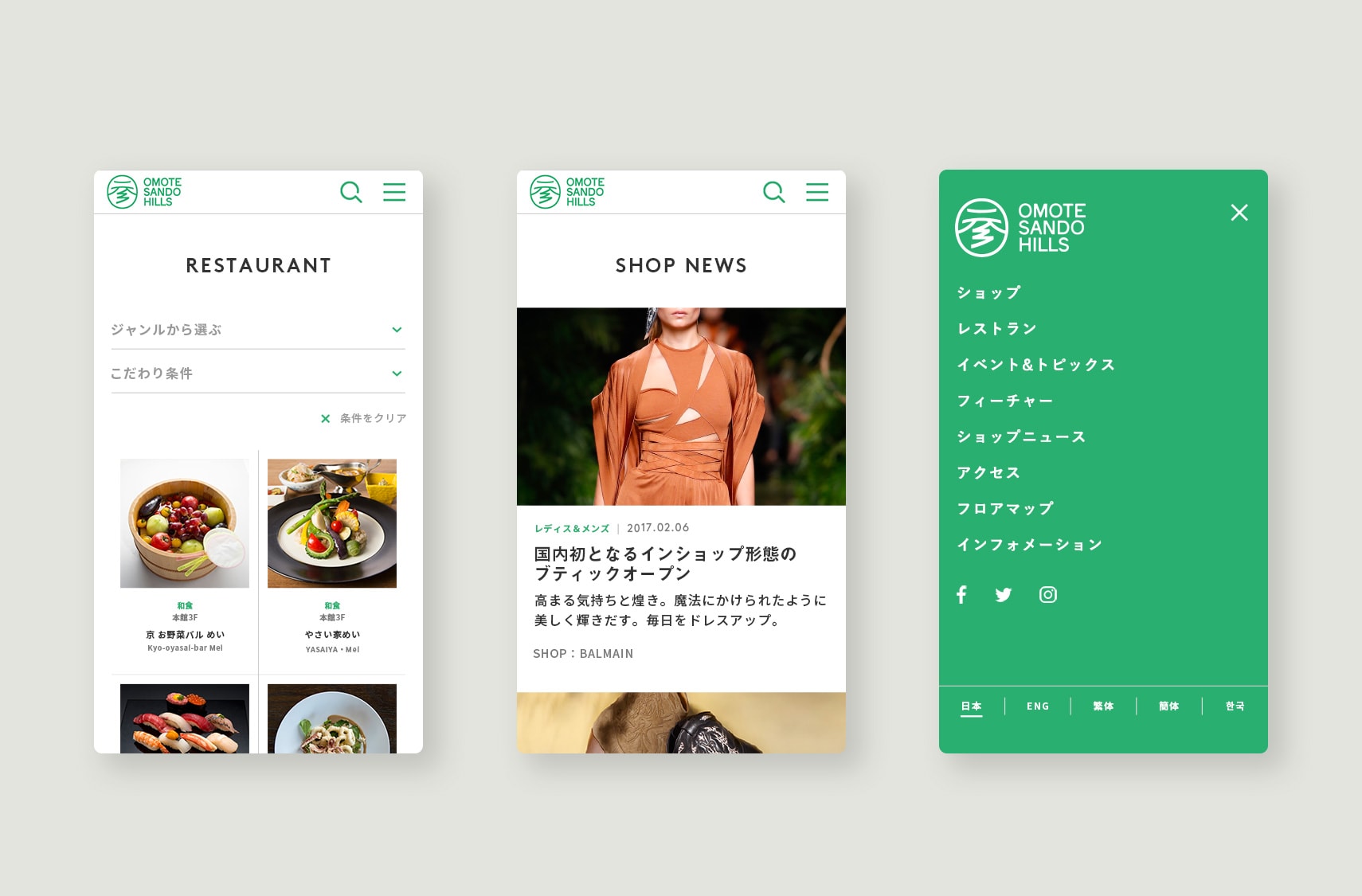
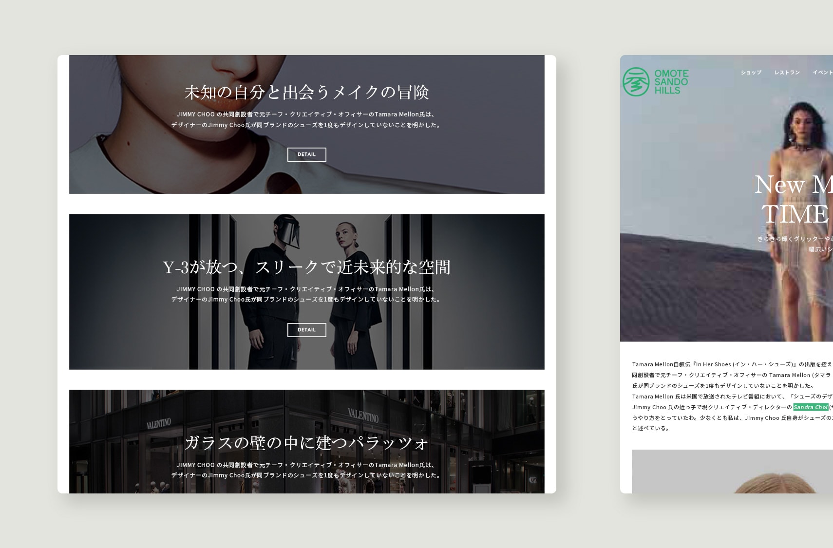
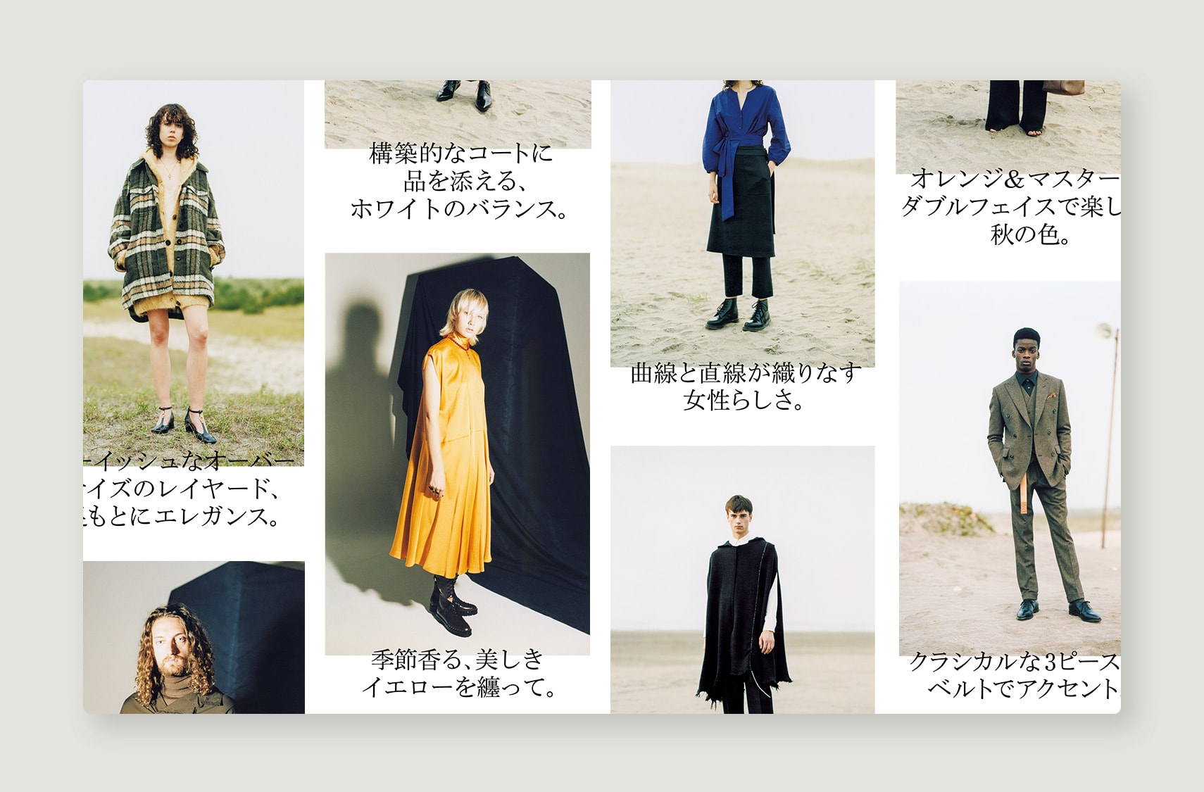
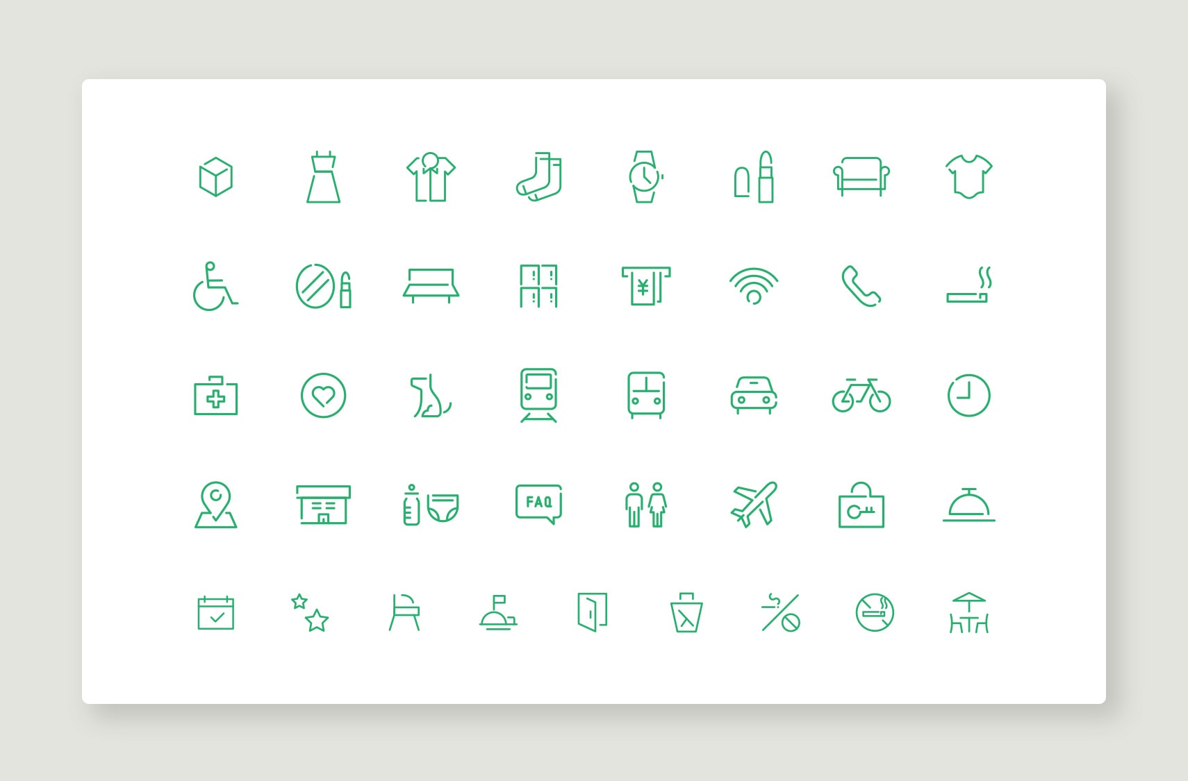
SIMONE handled the art direction, UI & UX design, development, and content direction for the new website for Omotesando Hills – an iconic Tokyo landmark – which recently celebrated its 10th anniversary. The quality and diversity of the facility, which encompasses everything from high-end brands to trendy confectionery stores, is reflected in the Japanese typography. We used a green brand color based on the zelkova trees that line the street outside, along with icons drawn in a single stroke to create the image of the straight Omotesando street.
TEAM
- CREATIVE DIRECTOR :KAIE MURAKAMI
- ART DIRECTOR :OSAMU JIMBA
- DESIGNER :OSAMU JIMBA
- PLANNING :RINA KYORAKU
- PRODUCER :TAKAMICHI MASUNAGA